CPG Packaging Design for Founders: What You’re Actually Paying For. There is no single catastrophe.
That’s the first thing to understand. When packaging fails a funded founder, it’s almost never one dramatic mistake. It’s an accumulation. Little things, each one survivable on its own, stacking up until the product looks cheaper than it is and sells for less than it should.
I’ve had the calls. A founder with a luxury perfume in a box that felt, in the hand, like my collagen shot. Same paper, texture. Same weight. The product was meant to be expensive and the packaging quietly told the buyer it wasn’t. A business major, fresh out of uni, certain a colour switch would fix her sales when her site was invisible and her product was in the wrong vessel to begin with. A client who handed over files in RGB, sent them to print, and wondered why the colours came back wrong.
None of those is a disaster. That’s exactly why they’re lethal. A disaster gets caught. But a thousand small compromises get shipped.
And they all trace back to the same root. The founder hired someone to execute, when what they needed was someone to interrogate.
Why the cheap designer is expensive
Here’s how most founders shop for CPG packaging design. They get two quotes. One around nine grand, one around fifteen hundred. Both say “packaging design.” Same words. So they pick on price, because on paper there’s nothing else to pick on.
The price was never the thing to compare.
The thing to compare is the discovery call. What did the designer ask you? Did they want to know what your product costs to make and what it sells for? Were they curious who actually buys it and where it lives on a shelf? Or did they just ask what colours you like and nod along?
A cheap designer is a yes machine. You want pale yellow on kraft, you get pale yellow on kraft. Never mind that it’ll print like dishwater, even with a white pass underneath. You want gold foil, you get gold foil, never mind that you’re selling a ten dollar product and that foil just ate your margin alive at scale.
The expensive part of a cheap quote is everything it doesn’t include. No one pushing back. Nobody telling you the truth. And nobody asking the uncomfortable question before you’ve spent the money.
The question a cheap designer never asks
When a rebrand client lands on my call, I ask three words.
Why are you here?
It does something an intake form can’t. It makes them account for themselves before I’ve touched a single pixel. And the answer sorts them immediately.
There’s the founder with a real business problem. Sales stalled for a reason they can name. They’ve outgrown the brand they started with, and they know it’s time to get serious. That’s a project worth taking.
Then there’s the founder repainting a house with a cracked foundation. Bored of their own logo. Convinced a fresh colour palette is the fix. No real read on who they’re for. That’s a founder about to waste nine grand making an invisible brand slightly prettier.
Because that’s the gap underneath the whole thing. Founders think prettier fixes it. It doesn’t. Visible fixes it. Prettier is what you do after you’ve solved visible, and visible starts with knowing exactly who you’re for.
I had a client who’d had their packaging done on Fiverr. Looked fine. But sales weren’t there, long term, and they couldn’t work out why. The packaging wasn’t broken. The strategy underneath it never existed.
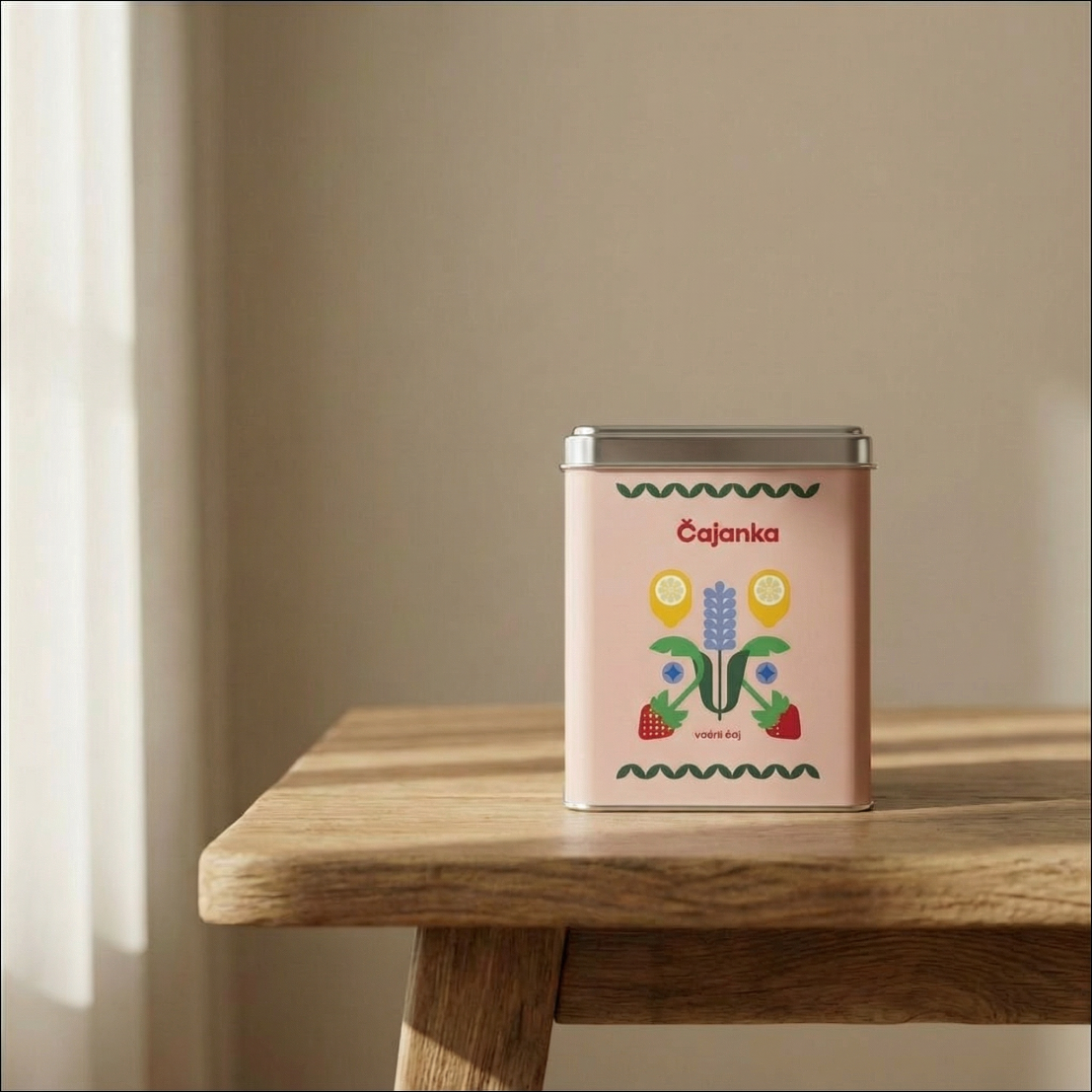
Compare that to Čajanka. They came to me with a Canva logo and understood, on their own, that it was time to invest. We didn’t make them prettier. Instead, we made them visible. The feedback they get now isn’t “nice packaging.” It’s that the tea is incredible and the whole brand has a story you can feel. That’s the difference. One founder bought a file. The other built something a customer reaches for because of how it makes them feel.
A pretty package on an invisible brand is just a nicer headstone.
Every production decision is a margin decision
This is the part founders don’t see coming, and it’s the part you’re really paying a studio to manage.
Every choice in CPG packaging design is a commercial decision first and an aesthetic one second. The cheap designer gets this backwards. They design for the mood board. So they spec the finish that looks incredible in their portfolio and never ask what it costs you per unit at ten thousand pieces.
I’m realistic about this. If you’ve got a ten dollar product, you aren’t gold foiling anything. It will destroy your margins. The finish that wins the design award can be the same finish that quietly kills the business.
So before anything gets specced, the real questions get asked. What’s your total area coverage, because heavy ink coverage behaves differently on press and costs differently too. Did you pick that deep blue off a Pinterest palette, and will it actually print, or will it come back muddy and dull. Neons and sages are the worst offenders here. They look one way on a backlit screen and nothing like it once they’re on stock. Are you printing on kraft, coated, or uncoated, because the same colour lands three different ways across those three substrates. And the big one almost no founder connects to design: where does this product actually live? On a crowded retail shelf? Direct to consumer in a mailer? Amazon only, where it’s competing as a thumbnail before anyone touches it?
Each of those answers rewrites the brief. A package that dominates a physical shelf can die as a one-inch Amazon image. There’s logic behind every choice, and the logic is rarely about taste.
Why your colours come back wrong
Which brings me back to the RGB files. In plain terms: screens make colour with light, presses make colour with ink, and they don’t speak the same language. So when you send a printer your RGB files, the press translates them however it likes. That’s why the colours came back wrong. A good studio works in the right colour space from the start and proofs against it, so you never have to know any of this happened. That’s the invisible work. It’s exactly what you’re paying to never think about.
What nine grand actually buys
So, the gap between the two quotes.
The fifteen hundred dollar designer sells you a deliverable. Files. A logo, some labels, done. They ask what you like and they give you that.
What I sell is strategy and positioning, and the design is the result of it, not the start. Take Čajanka again. The tea category is drowning in two looks: clinical wellness minimalism and rustic farmers market botanicals. Both saturated. Both forgettable. The brief was never to look like a premium tea brand. It was to look like nothing else in the category.
So we didn’t design a tea brand. We built from a feeling. Sitting at your nan’s table, the checkered cloth, a proper cup of tea together. Being present. A moment for yourself, not a wellness transaction. That feeling became a system that scales across hundreds of SKUs, moved the brand from web-dependent sales into one of Zagreb’s most respected restaurants and boutique hotels across the region, and the team can update it themselves in Canva without a designer on call.
That’s what the nine grand buys. Not a nicer file. A reason the product can charge more.
Here’s the cleanest proof I have. Winston & Co went from competing with five dollar PetSmart treats to selling at thirty dollars a bag. Same product. Different packaging. Different story. So the packaging didn’t make the treats better. It made the price make sense.
You cannot see that on a quote. It looks like a bigger number for the same words. It isn’t.
Who this is for, and who it isn’t
People buy the feeling. On the shelf, yes, but also on the call. The feeling that someone competent is on their side and actually wants them to win.
So here’s who should book a call.
The founder who isn’t asking for a discount. Who isn’t running the proposal through ChatGPT to find an angle to argue the price down. And who understands they’re buying a human brain with seventeen years in it, on their side, with one job: to make their product worth more than it currently is. That founder gets it. They’re investing, not spending.
And here’s who should quietly close the tab.
The founder hunting the cheapest option, treating judgment like a vending machine, certain they already know the answer and just need a pair of hands to execute it. We’ll both waste our time and theirs. I’d rather they find that out now than nine grand from now.
If your product is worth more than it’s currently charging, that’s the whole job. Making the price make sense.
Tell me why you’re here. Or see what the work costs and what’s included.
+ view the comments