Packaging Design Mistakes: 7 Signs You Need a Rebrand (and 1 You Don’t). A founder filled in my contact form last month after watching my work for the better part of a year. She did not need convincing. She had already gone the Fiverr route, watched it backfire, and worked out the cheap option is just a way of paying twice.
Most packaging design mistakes are not mistakes of taste. They are mistakes of decision. A founder picks the cheap quote, or the trendy look, or keeps the logo their cousin made in 2014, and the shelf quietly punishes them for it.
This post is the diagnosis. Seven signs your packaging is the thing holding your brand back and a rebrand is the cheapest fix available. And one honest sign you should keep your money in your pocket, because not every brand needs this and I would rather tell you the truth than sell you the work.
Your packaging gets three seconds. Most of them are wasted.
Nobody on a shelf is admiring your kerning. They are deciding, in about the time it takes to blink, whether you exist. On a shelf of fifteen near-identical products, most brands simply do not.
That is the brutal frame for every packaging design mistake below. Your label is not a piece of art being studied in a gallery. It is a sales tool being judged in a hurry, at a metre’s distance, under bad lighting, by someone tired who has no idea who you are and no reason to care yet.
Get that frame right and the mistakes become obvious. Here are the ones I see most.
The packaging crimes I see most
1. You designed it for yourself, not the buyer
This is the mistake underneath most of the others, so it goes first.
You chose the colour you love. The font that makes you feel something. The minimalist look that matches your own taste. But you are not the one standing in the aisle with your wallet out. A stranger is.
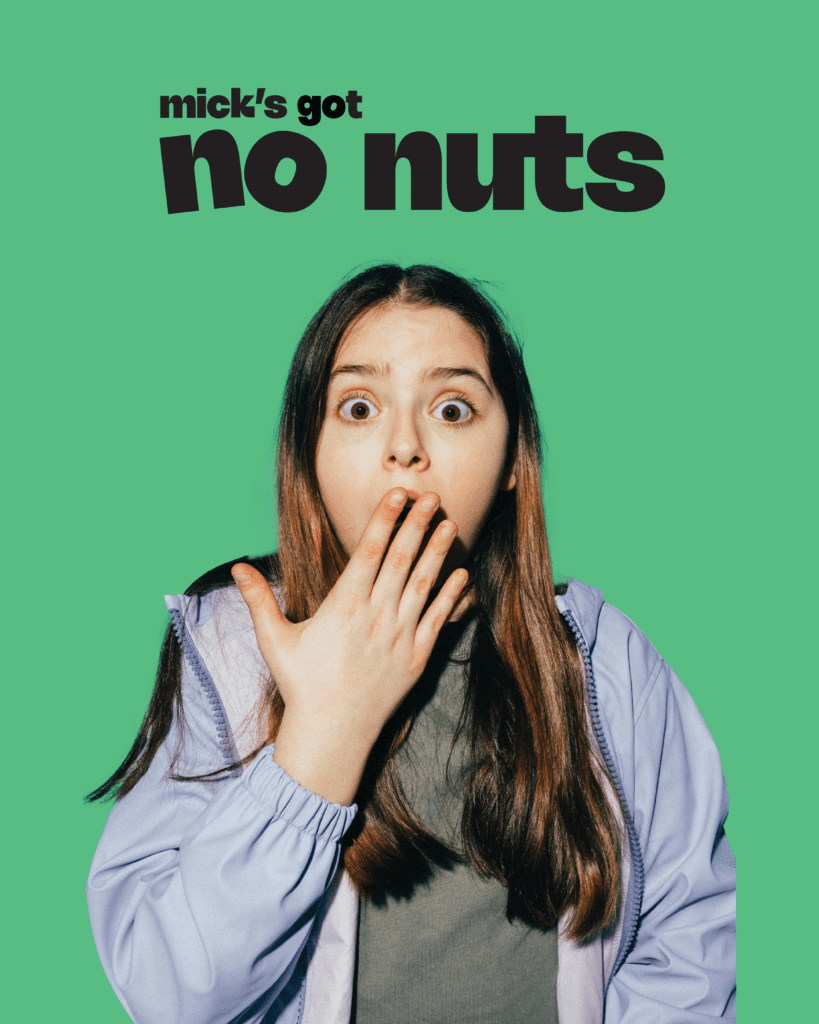
I redesigned a nut-free protein bar called Micks Got No Nuts. Great name. The problem was everything around it: a cartoon character that looked suspiciously like a certain famous mouse, fronting a children’s product, on a bar whose entire reason to exist is keeping kids with allergies safe.
The fix was not “make it prettier.” It was working out who actually buys this. The answer was a tired parent carrying an EpiPen for their kid, who needs reassurance before they need a joke. A name that cheeky has to be countered by design that builds trust, or the buyer never gets past the smile to the safety. He understood it the moment he saw the strategy. Not the design. The strategy.
That is the lesson hiding in most packaging design mistakes. The quirkier your brand, the harder your design has to work to earn trust. The two pull against each other on purpose.
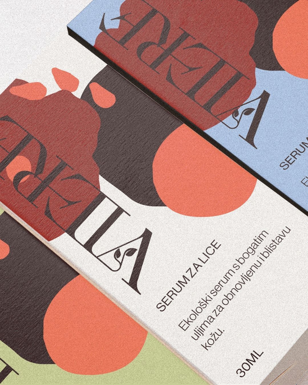
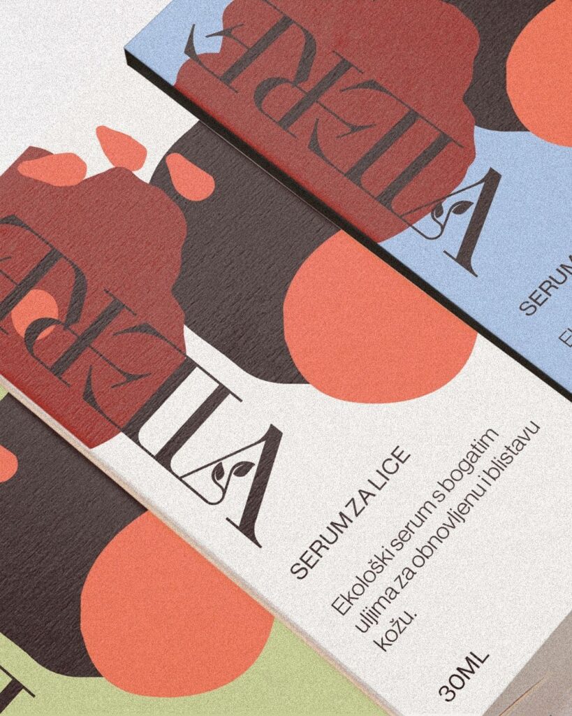
2. Your range looks like five different companies
A serum, a cream, a cleanser, all from the same brand, all looking like they were made by three businesses who have never met.
A customer loves one of them and cannot recognise the other two as yours on the shelf. You did not build a range. You built three only children and introduced them at a party. The repeat purchase you earned on product one never finds its way to products two and three, because nothing tells the buyer they belong together.
3. Your colours and contrast give up at the shelf
Cream text on a cream background looks tasteful on your laptop at 200% zoom. Out in the real world, a metre away under a fluorescent strip light, read by someone with tired eyes, it is invisible.
People do not buy what they cannot read. Minimalism that deletes legibility is not sophisticated. It is a mistake wearing a nice coat.
4. You chased a trend and became a tribute act
You saw Liquid Death, Poppi, Graza, and thought, “I will have what they are having.”
So now you are the ninth brand this quarter wearing someone else’s swagger like a borrowed jacket. Here is the part the trend-copiers miss: those brands won precisely because they looked like nobody else. Copying the look means missing the entire point of why it worked. You cannot stand out by blending into the people who stood out.
5. You are different for the sake of being different
The opposite mistake, and just as expensive. A bottle shaped like nothing on earth that will not stand, will not stack, will not pour.
Different is not a strategy. It is a tantrum. Function and beauty are not enemies, they are a couple. A bottle that will not pour is not bold. It is a vase with ideas. Retailers will not range what will not sit on their shelves, and customers will not rebuy what annoys them every day.
6. You are still loyal to a logo that stopped working
The identity your cousin made in 2014 on a cracked copy of Photoshop. You keep it out of loyalty. It is loyal to nobody.
It has been quietly costing you money for years while you call it “iconic.” Sentiment is lovely. Put it in a frame, not on the shelf. Holding onto a brand identity because you are emotionally attached to it is one of the most expensive packaging design mistakes there is, precisely because it never feels like a mistake. It feels like heritage.
7. Your packaging makes a promise the product cannot keep
A hero shot of food so glossy it has never existed in this dimension. “Natural,” “organic,” “handmade,” on something grown forty metres from the motorway. A claim like “results in eight weeks” you cannot actually back.
These are the costly ones. When the product does not match the promise, you do not lose a sale. You lose the customer, you eat the refund, and you wear the one-star review that ranks on Google forever. The other mistakes cost you taste. This one costs you trust, and trust does not grow back in eight weeks either.
The contrarian bit: clarity beats beauty
Here is something I did with my own money this week, which contradicts what most designers will tell you.
I was buying a natural perfume. Two brands, same price. One was a Scandinavian brand with beautiful, minimal packaging. The other was French, and to my taste, the packaging was uglier.
I bought the French one. Not because it looked better. Because it did a better job explaining itself. I could imagine the scent. With the minimal one, I had no idea what I was getting.
That is the mistake hiding inside “minimalist” and “premium.” Aesthetics did not win that sale. Comprehension did. Leaving things off is easy and looks sophisticated. Doing the hard work of communicating clearly while still looking good is the actual job, and it is the one most brands skip because the empty version photographs nicely.
So the punchy version is: ugly that works beats beautiful that does not. The honest version is: clarity is a feature, and minimalism often deletes it. Both are true. Neither is what your designer wants to hear.
The one sign you do NOT need a rebrand
Now the part I promised. Sometimes the answer is no.
If you are printing 500 units of something, do not spend $9,000 on a rebrand. The maths does not work, and I will tell you that on the call rather than take the project. A premium identity has to be carried by your numbers, and at a 500-unit run, it cannot be.
The deciding factor is not “do you want nicer branding.” Everyone wants nicer branding. It is your print run and your per-unit cost.
The founder I mentioned at the top is launching 10,000 skincare units. Spread a proper strategy-led rebrand across that run and it works out under a dollar per product. Suddenly $9,000 is not a luxury. It is the cheapest insurance she will buy all year, and the thing that lets her charge enough per unit to make the whole launch make sense.
That is the test. Run the maths. Take the investment, divide it by your run, and ask whether ninety cents a unit to fix every mistake above is expensive or the bargain of the launch. If it is the bargain, your packaging is not a cost. It is the lever that lets you raise your price, which is exactly what it did for Winston & Co, who went on to a 200% retail price increase after their rebrand.
So, do you need a rebrand?
You need one if you recognised your own shelf in three or more of those mistakes, your run is big enough to carry the investment, and you have a genuinely good product that your packaging is currently lying about. That last one matters. A rebrand makes a good product look as good as it is. It cannot save a bad one.
You do not need one if your run is tiny, your packaging is already clear and recognisable, and your real problem is somewhere else entirely, in your price, your distribution, or your marketing. Lipstick on the wrong pig is just an expensive pig.
If you are in the first group, that nagging feeling about your shelf is probably right. You can see the case studies and what they moved here, from a Canva logo turned premium tea brand to olive oil that sold out in three weeks with no ads.
And when you are ready to work out whether your numbers carry it, tell me about your brand. I work with one client at a time, strategy first, so the label is built for the stranger buying it instead of the founder who loves it. Projects start at $9,000. For some of you that is ninety cents a unit. For others it is a no, and I will be the one to say so.
FAQ
How do I know if my packaging is a mistake or just not to my taste? Stop judging it on your laptop. Look at it the way a buyer does: at arm’s length, fast, next to competitors, with no prior knowledge of your brand. If it is hard to read, hard to tell apart from the shelf, or makes a promise the product does not keep, that is a mistake, not a matter of taste.
How much does a CPG packaging rebrand cost? Strategy-led packaging projects with Studio Stoked start at $9,000 USD. Whether that is expensive depends entirely on your print run. Across a large run it can work out under a dollar per unit, which is why the size of your launch matters more than the headline number.
Will a rebrand actually let me raise my price? It can, when the product justifies it and the old packaging was underselling it. Winston & Co raised their retail price by 200% after repositioning from hidden rewards to a premium ritual. The packaging gave the buyer permission to pay more. It does not work in reverse: design cannot make a weak product worth more for long.
Do I need a rebrand or just a refresh? A refresh tidies what is already working. A rebrand is for when the identity itself is the problem, when it is invisible on shelf, looks like a different company across your range, or is a sentimental hand-me-down that stopped serving you. If three or more of the mistakes above describe your shelf, you are likely past refresh territory.
+ view the comments