Read about packaging that stands out on store shelves
I was in a founder forum recently. Someone had posted a photo of their fruit pouch packaging asking which tagline would work better. The packaging was beautiful. Soft, warm, illustrated. A little rabbit on the front, earthy tones, the kind of thing that makes you want to buy a linen apron and start a sourdough.
They were selling it in college vending machines.
The product was fine. The packaging was genuinely lovely. But the person standing in front of that vending machine at 11pm, running on three hours of sleep and bad decisions, was never going to pick it up. It was speaking to a farmers market mum on a Saturday morning in October. Not a 20-year-old who considers Monster an acceptable breakfast.
And they were asking a forum about taglines. Not their designer. A forum.
That is not a tagline problem.
That is the thing about packaging that stands out. It is not about beautiful. Beautiful is everywhere. It is about being exactly right for the person staring at the shelf.
Here is what that actually looks like.
Your Customer Is Not You (Sorry)
Founders always have a vague idea of who their customer is. “Health-conscious women, 25 to 45, values quality.” Cool. That is also the target market of approximately 4,000 other brands on the same shelf.
What I need to know is specific. Almost uncomfortably specific.
Where are they shopping on a Tuesday evening? What does their bathroom shelf look like? What else do they buy, and what do those brands say to them? When I worked on Winston and Co (a premium pet treat brand out of New York), we were not just designing for dog owners. We were designing for the person who shops at Flamingo Estate, whose home looks like a magazine, who treats feeding their dog as a ritual rather than a chore. Every detail spoke to that person.
And precisely because of that, it worked.
The instinct is always to cast a wide net. I get it. You want everyone to buy your thing. But packaging that tries to talk to everyone ends up connecting with no one. Make the pool smaller. It is easier to catch something that way.
Standing Out Does Not Mean Doing What the Popular Brand Did
Every few years, a CPG brand does something unexpected and it lands. Within eighteen months, half the shelf is doing a version of the same thing. Suddenly “standing out” looks identical across an entire category.
Graza olive oil. The squeeze bottle, the casual tone, the friendly illustration. It was genuinely fresh when it launched. Now there are fifteen olive oils trying to be Graza. None of them are standing out. They are just part of a newer, more crowded version of the same problem.
Copying someone else’s success does not get you their success. It gets you their leftovers, six trends too late.
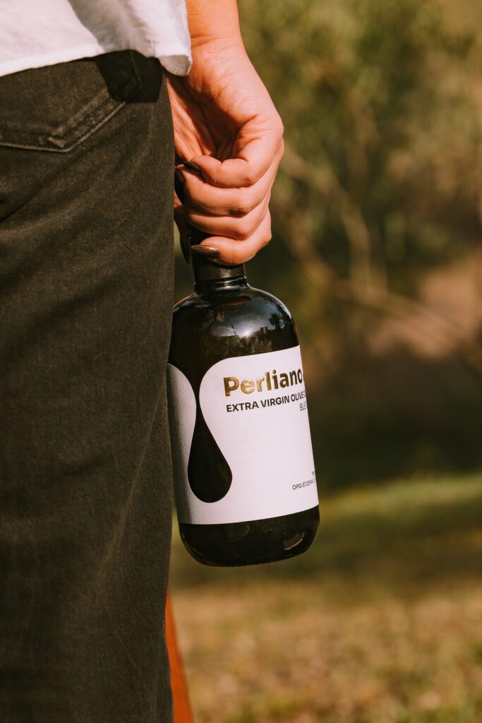
The packaging that actually stops people does something unexpected for that specific category. An unusual format. A material that feels wrong in the best way. A structural detail that the eye finds before the brain does. I worked on Perliano, a Croatian olive oil, where a custom die cut label does exactly that. A small, precise detail on a shelf full of rectangles. You do not need to reinvent the product. You need one thing that makes a stranger pick it up.
And then there is copy. Mick’s Got No Nuts (yes, a real brand, yes it is a nut-free product) does not need to explain its point of difference. It already made you feel something. That is the job. Clever, specific, audience-aware copy that touches a nerve earns more shelf space than a perfect gradient ever will.
The Founder Story Is Usually Where I Find the Idea
Seventeen years of asking questions has taught me one thing: the direction is almost always hiding in the founder, not the category.
Every founder has a story. Most of them have edited it down into something safe for their About page. I go looking for the unedited version.
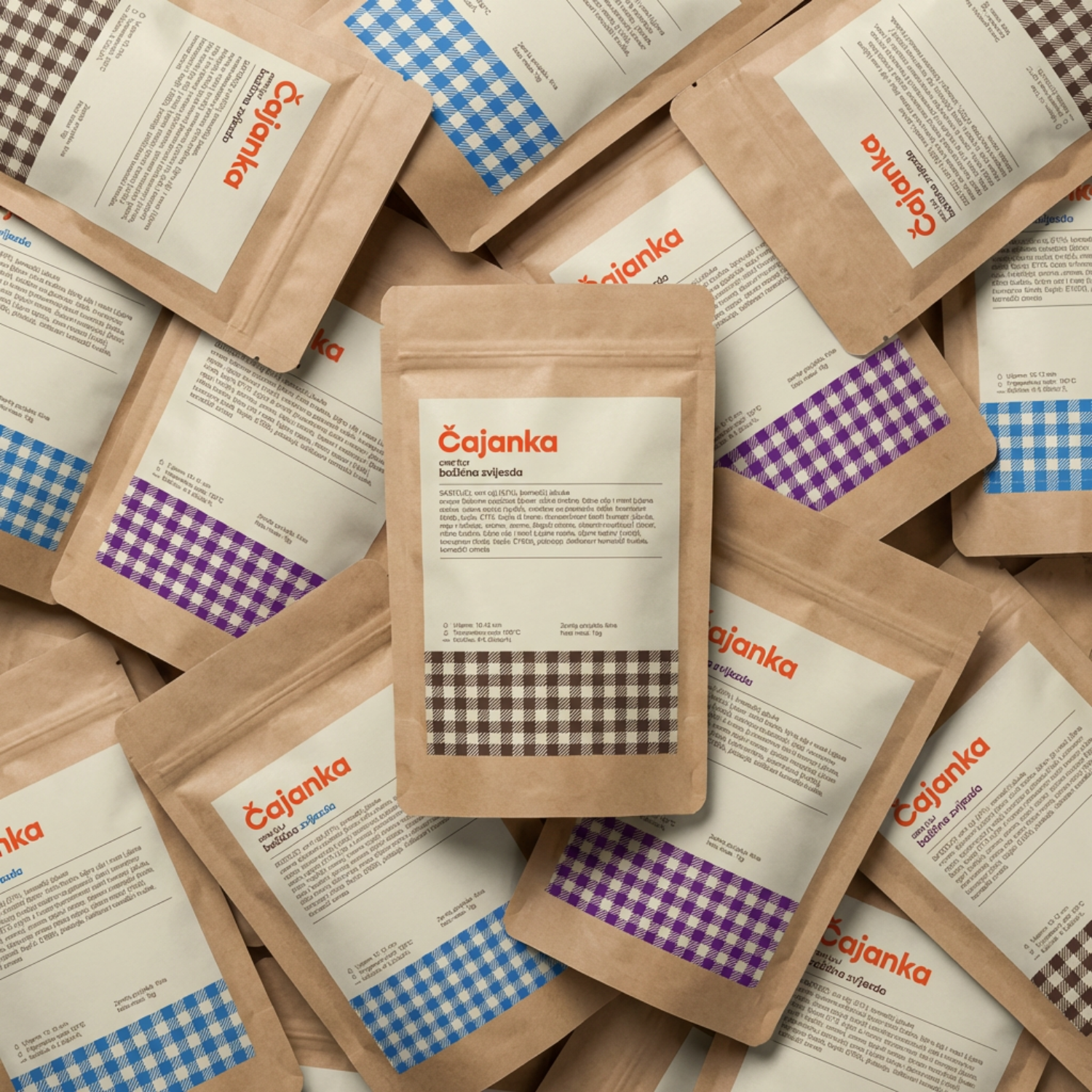
With Cajanka, a Croatian tea brand, the direction did not come from the competitor analysis. It came from one detail in the founder story. The feeling of sitting at your grandmother’s kitchen table while she made you chamomile tea from the garden. That was it. The packaging went deliberately retro and warm, the opposite of the clean minimalism saturating premium tea at the time. It stood out because it meant something real.
If your packaging could belong to any brand, it belongs to none of them.
The trust and personality question (do I look credible, do I feel like me) gets answered through that story. Not through trend reports. Not through what your competitor launched last quarter. Through the thing that is actually only yours.
Good Packaging Gets Your Foot in the Door. That Is Its Whole Job.
This is the hardest thing to hear after you have invested real money in getting your packaging right.
Packaging is the outfit. It gets you noticed. It earns the first pick-up. That is the whole game on a busy shelf. But it is not closing the sale.
The sale happens because of what is inside. Because of what the brand does after purchase. Because of the trust built over time with the people who bought it once and came back for more.
Packaging that tries to do all of that tips from confident into desperate. It loses the thread. Know what your packaging needs to do (get noticed, communicate who it is for, earn the pick-up) and let the rest of your brand do the rest of the work.
Packaging is the outfit. Marketing is leaving the house.
So What Does Shelf-Standout Actually Look Like
A specific, honest picture of who the customer is. Not who you hope they are. Where they shop, what they already buy, what shelf your product is sitting next to and who is standing in front of it.
One unexpected detail. Format, material, copy, structure. Something the eye finds before the brain catches up.
Copy that earns its space. Not descriptive. Not generic. Specific enough that the right person feels seen and the wrong person walks past.
A founder brave enough to make the pool smaller. Not “everyone who likes quality.” The actual person.
And the willingness to be different in a way that is yours. Not borrowed from whoever is getting press this month.
If your product is ready and your packaging is letting it down, that is a fixable problem.
See how I work with CPG founders on packaging that actually sells.
Want to know what the process looks like start to finish? Here are my packaging design services.
When you are ready to talk, book a discovery call.
Related reading:
- How to find the right packaging designer
- How much does packaging design cost?
- CPG packaging design: what founders need to know
Studio Stoked is a CPG packaging design studio working with food, beverage, skincare, wellness, and pet founders at pre-launch and early-stage. One client at a time. Designing globally from Croatia.
+ view the comments