The short answer
Good olive oil packaging design starts with positioning, not the bottle. Work out who you’re selling to, where the bottle will sit and what’s actually true about your oil. Then the glass, size, label and print specs more or less pick themselves.
Do it the other way round and you get a very pretty bottle that can’t hold its price. Like a very handsome man who can’t hold a conversation. Lovely to look at. Not coming home with you.
I’m Marta Čustić, founder of Studio Stoked. I’ve spent 17 years in brand strategy, packaging and print production, and I work with one client at a time, mostly because I can only be stressed by one set of label proofs at once.
I also own a small olive grove in Croatia. Every October I hand pick it, complain about it, and work out what a litre of good oil actually costs to make. The answer is my lower back. So when I talk about olive oil packaging, I’m talking from both sides of the bottle.
The biggest mistake in olive oil packaging: choosing the bottle before the customer
Most olive oil packaging fails for one boring reason. The founder picked the packaging before they picked the customer. It tends to turn up in three outfits.
The trend chaser. One squeeze bottle goes viral and suddenly everyone wants a squeeze bottle with a cartoon on it. The format is borrowed from ketchup, the mascot is borrowed from cereal, and the price is borrowed from optimism. The original brand chose that bottle for a specific person who cooks with oil every night. The copycats copied the answer and skipped the homework. It’s like cheating off someone’s maths test without noticing they were sitting a different exam.
The sentimental hoarder. “We want a complete rebrand.” Lovely. “But the tree stays. And the font. And Grandad’s border.” So, a rebrand where nothing changes. Customers can’t see a new direction if you refuse to leave the driveway.
The AI render. A founder sends me a generated image of their vision. It’s gorgeous. The bottle has the kind of glow usually reserved for religious paintings. Then I ask who buys their oil, and there’s a long silence. A render tells me what you like. It doesn’t tell me what anyone will pay for.
Underneath all three is the same question. Are you heritage or new school, who are you selling to, and who are you sitting next to? And if you’re charging €40 a bottle, it can’t look like it fell off the bottom shelf at the discount supermarket. Nobody pays boutique prices for something that looks like it comes with a free trolley.
Two olive oil brands, one designer, opposite outcomes
Same category, same designer, very different endings. The variable wasn’t the talent. It was whether the founder could let go.
The rebrand that changed nothing
One producer came to me wanting a fresh look. What they actually wanted was the old look, but feeling fresher about it. Every element was precious. I made a cleaner, better layout, but because the core stayed, perception barely moved. Then, to save a few cents, they printed it on cheap glossy paper. The label now looked exactly like the thing it was trying to escape, only shinier. I still think about it in the shower.
Perliano: daring to look different
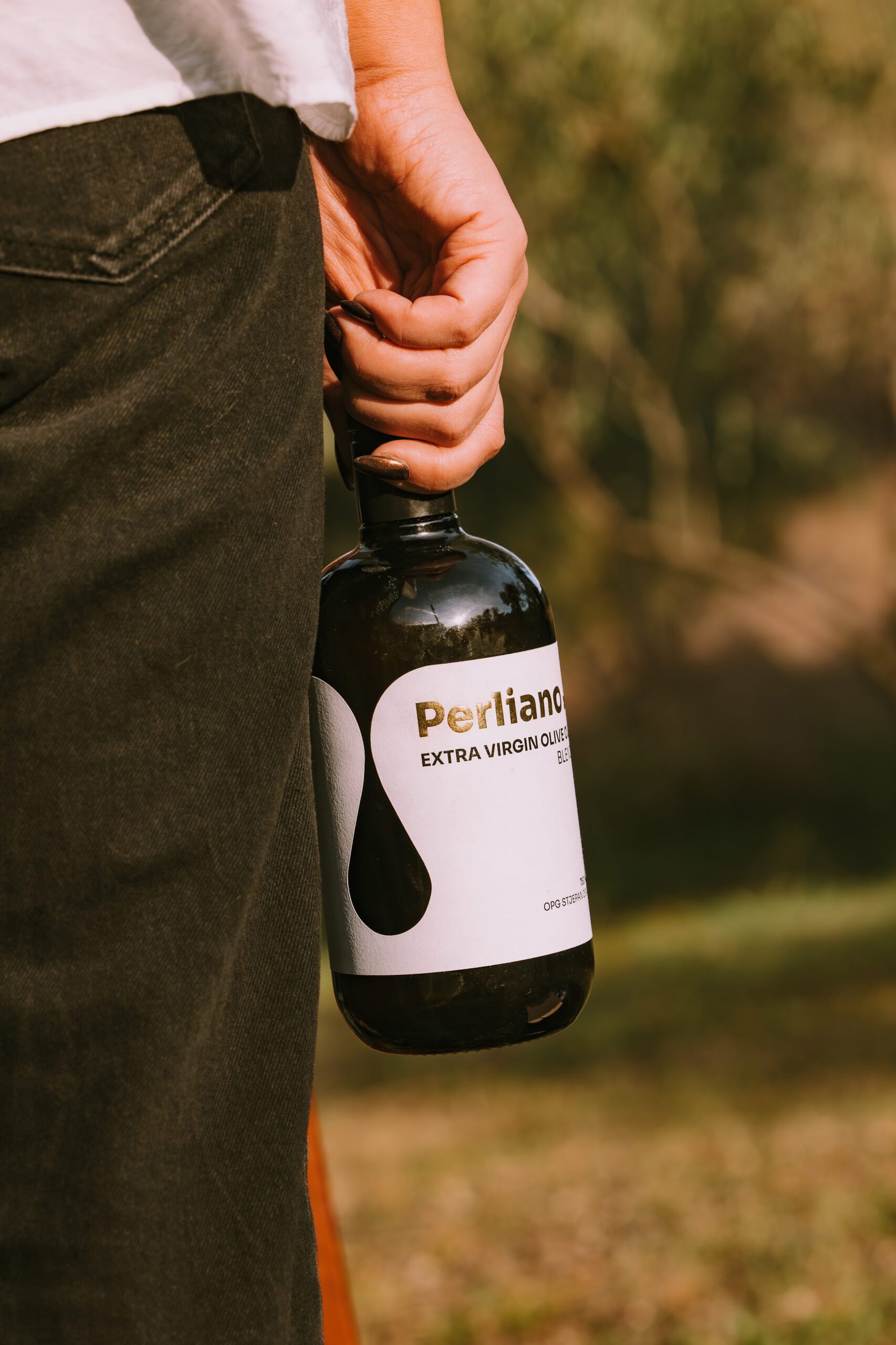
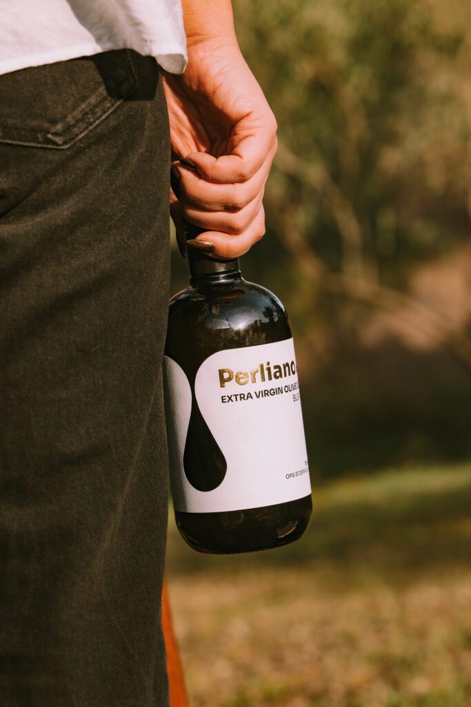
Perliano is a young Croatian producer whose founder wanted to do things differently. No family crest, “since 1823.” No pretending to be a Tuscan count. We positioned it as modern Mediterranean luxury and built the packaging from there:
- A white label with an organic droplet shape inspired by the flow of oil
- Gold foil detailing for tactile quality
- Clean sans serif typography
- Dark glass for UV protection
- A matte label stock that people want to touch
The result: the oil sold out and he raised his prices. On a tasting table, his is the bottle people pick up first, usually while asking who designed it. (Me. It was me.) The project was also featured on Packaging of the World.
Notice what’s not on the label: an olive tree. Yes, there are olive branches in the photography, because lifestyle shots need context. On the label, olive clipart is a crutch. Every bottle on that shelf already says olive oil. Putting a tree on yours is like wearing a name tag that says “Human.”
How to choose the right lane: Market, Shelf, Truth
Before I draw a single thing, every olive oil brand gets the same three questions. The packaging is the answer to all three, never the opening line.
- Market. Where are you selling? Italy and Spain are saturated. You’re up against a thousand family producers and everyone’s nonna, and nonna does not respect your typography. In the US or Northern Europe you’re often educating buyers who’ve been drizzling something questionable for years. Are you doing something genuinely different, or the same thing in a nicer font?
- Shelf. What are you sitting next to? DTC, deli, supermarket, export or gifting. Each has different neighbours and about three seconds to win. Go and stand in front of the actual shelf. Your bottle doesn’t have to beat every oil in the world, just the ones either side of it. But it does have to beat them.
- Truth. What’s actually real about your oil? Hand picked or shaken off the tree? Early harvest or volume? Your own grove or bought-in fruit? What do you believe about how oil should be made? That’s the raw material of your story, and customers can smell an invented one faster than rancid oil.
Think of it as the old pub versus the microbrewery. Both pour good beer. Both have regulars. The problem is the bloke at the bar picking his pint by which can has the cutest cartoon on it. Olive oil now has that bloke too. He’s holding a squeeze bottle and he’s very pleased with himself. Design for the regulars, not for him.
Olive oil bottle design: the physical decisions that set your price
Once the strategy’s done, these are the decisions that make or break a premium bottle. Less romantic, more expensive to get wrong.
Glass vs plastic
Plastic is a positioning decision, and most founders don’t realise they’ve made one. PET lets in more oxygen than glass and protects less from light, so the oil goes stale faster. On shelf, plastic also says “cooking tool,” not “treat yourself.” That’s fine for an everyday oil priced like one. At €40, it’s a problem. Put premium oil in plastic in front of anyone from an olive growing family and watch their face. That’s your focus group. Use dark glass or a tin.
Bottle shape and size: 500ml or 750ml
My recommendation is 500ml or 750ml. Borrow from wine: a 750ml bottle looks more expensive than a litre because shoppers already link that shape with something worth paying for. 500ml is the sweet spot for a premium bottle people actually use, while still feeling special. A litre reads as a pantry staple, and staples get compared on price. Nobody gifts a litre of anything except vodka.
Label design for real production
Who is sticking on 10,000 labels? With small producers, it’s often the founder and a cousin at the kitchen table. A design that needs millimetre precision on a curved bottle will be crooked by label 400 and abstract art by label 4,000. Label shape, wrap and placement have to suit how they’re applied, by machine or by human.
Paper stock and closures
Matte paper feels premium and people love touching it. Perliano uses matte stock and customers practically stroke the bottle. The condition is a proper closure: a pourer with a drip stopper keeps oil off the label, so the matte stays beautiful. And please don’t downgrade to cheap glossy paper to save a few cents a label. It undoes every decision you paid for. It’s like buying a beautiful suit and wearing it with thongs. The footwear kind.
What my own olive grove taught me about packaging
Every October I harvest my own small grove in Croatia. It has taught me many things, mostly about my hamstrings, but one above all: customers don’t pay for your effort. They pay for what they believe they’re getting.
Last year was a dry season with a small yield. Hand picking is back breaking work, and in my family, shaking the trees is close to a sin. There’s a good reason for it, beyond the guilt. Hand picked fruit reaches the mill with less bruising, and bruised olives start oxidising and fermenting before they’re pressed. Less damaged fruit, cleaner oil.
Plenty of small producers also mill on traditional stone wheels. That’s craft and character, and it deserves to be told. Just don’t claim it makes the oil chemically superior. Modern extraction often wins on that front, and the oil nerds will find you. They always find you.
None of this sells itself. A dry year and a sore back are your costs, not the customer’s reasons to buy. The job of olive oil packaging is to translate all that effort into perceived value, so the shopper reaches the same conclusion you did without you standing next to the shelf explaining it. That’s why producers get so emotional about labels. It’s a whole year of work squeezed into one rectangle of paper. Choose the paper carefully.
Olive oil packaging FAQ
What is the best packaging for premium olive oil?
Dark glass or a tin. Both protect the oil from light, and glass protects it from oxygen far better than plastic. Glass also signals quality on shelf, which supports a premium price.
Is plastic ever OK for olive oil?
Only if you’ve deliberately positioned the oil as an everyday cooking product and priced it that way. For anything sold as premium, plastic undercuts both the oil and the price.
What bottle size looks most premium?
500ml or 750ml. A 750ml bottle borrows the cues of wine and reads as more valuable than a litre, and 500ml is the sweet spot for a premium bottle people use every day. Litre formats look like pantry staples and get compared on price.
Should I put an olive tree on my olive oil label?
No. Every bottle on the shelf already says olive oil. Use your label to say what makes yours different, and keep the olive imagery for photography.
Matte or glossy labels for olive oil?
Matte, paired with a proper drip-stop pourer so oil doesn’t run onto the label. Cheap glossy paper makes a premium oil look like a budget one.
Should my olive oil brand look traditional or modern?
Neither by default. It depends on your market, your shelf and what’s true about your oil. A modern look won’t save an oil with no story, and a heritage look won’t help a new producer pretending to be 200 years old.
How much does olive oil packaging design cost?
It varies widely. At Studio Stoked, strategy, identity and packaging projects start from $12,000 USD. That includes the positioning work, which is the part that decides whether the packaging can hold its price.
Working with Studio Stoked
I work with one olive oil brand at a time, and every project starts with strategy before a single bottle gets drawn. If you’ve got real oil, a real story and the nerve to look different, I’d love to hear from you.
You’re a good fit if you:
- Want to charge what your oil is worth and need packaging that can hold that price
- Are ready to let go of what isn’t working, even Grandad’s border
- Want someone who understands both the brand and the print floor
You’re probably not a fit if your brief is a cartoon olive wearing sunglasses. Lovely guy. Not for me.
Still here? Get in touch through studiostoked.com.
+ view the comments